Working with Canvases
Canvases are the fundamental building blocks of your Webround site. Every page consists of a sequence of Canvases, which act as smart containers for your components.
Inserting a Canvas
If your page is empty or you want to add a new section, you will see two buttons: "Section" and "Carousel".
- Click on Section to create a standard Canvas.
By default, a new Canvas might appear quite short. Hover your mouse over the area to reveal the blue bottom border: click and drag this border downward to manually adjust the height.
Note: Canvas height is not dynamic; you decide exactly how much vertical space it should occupy.
The Grid (Mosaic)
Inside the Canvas, you will notice a mosaic of cells. These are the snap points: every component you drag will automatically snap to this grid, allowing you to maintain an organized and aligned layout.
Configuration and Context Menu (Part 1)
Right-click on the Canvas to open the context menu.
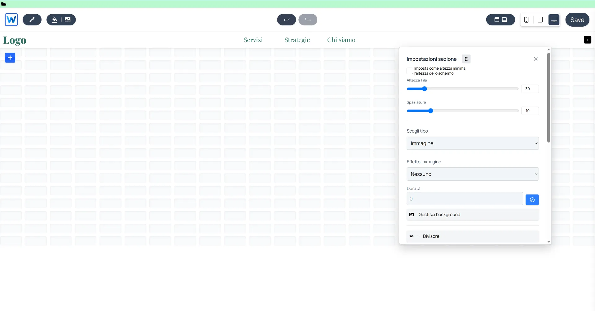
In this first section, you can manage:
- Cells and Spacing: Adjust the height of individual cells and the space (gap) between them. This allows you to position components closer together or further apart with extreme precision.
- Background: You can insert a background color, image, or video. Webround allows you to use up to two background images simultaneously and manage the transition between them.
- Divider (Shapes): This feature lets you insert SVG separators between Canvases, such as waves, zig-zags, or other geometric effects to add movement to your design.
Advanced Operations (Part 2)
By scrolling through the context menu or accessing the second section, you will find the flow management tools:
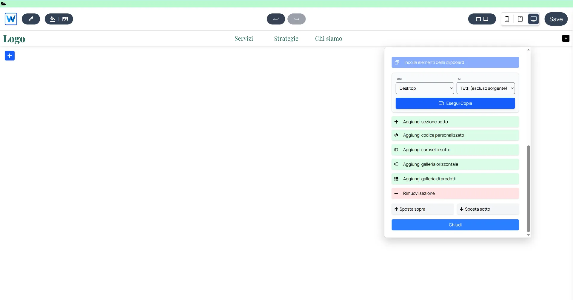
- Copy Across Devices: You can copy the entire Canvas configuration from one device to another (e.g., from Desktop to Mobile) to speed up responsive optimization.
- Page Flow Management: From here, you can add new elements above or below the current Canvas:
- New Canvas: Adds a standard section.
- Custom Code: Inserts an area for personalized React components.
- Canvas Carousel: Transforms the section into a slider of independent slides.
- Horizontal Gallery: Inserts a quick slider with a maximum of 10 filterable products from your WR Commerce store.
- Product Gallery: Inserts the main grid of your catalog.
- Ordering and Deletion: Move the Canvas up or down relative to other sections or remove it permanently.
Inserting Components
Once the Canvas structure is configured, it’s time to populate it with content.
You will notice a blue button with a "+" symbol located at the top left of the Canvas. Clicking it opens the components sidebar.
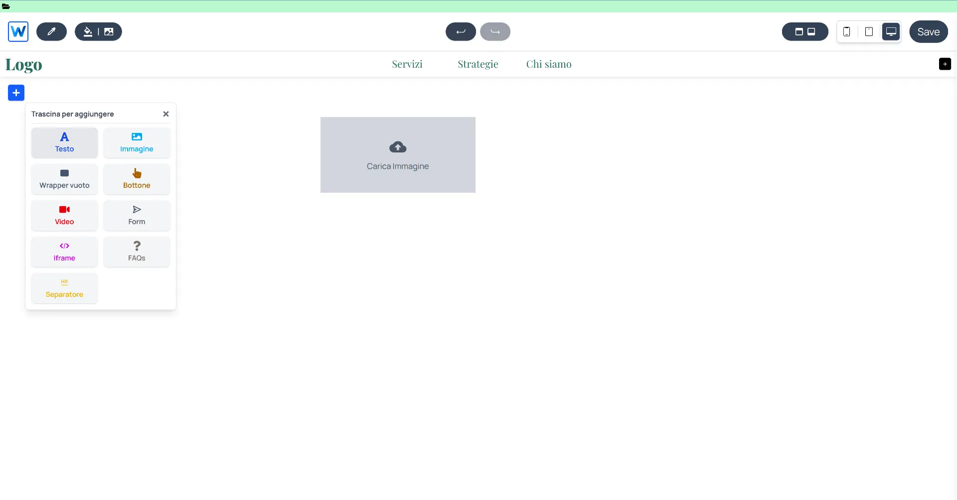
Drag elements from the sidebar directly onto the Canvas grid.
How to proceed:
- Drag & Drop: Choose the component you need (text, image, button, etc.), click on it, and drag it physically onto the Canvas.
- Positioning: Release the component onto the mosaic cells where you want it placed.
- Configuration: Once positioned, right-click on the component itself. This opens its specific context menu, where you can manage all style options (colors, fonts, borders) and functional configurations (links, data parameters, etc.).
Each component has a unique set of options. For example, an image’s context menu allows you to manage cropping and filters, while a button’s menu focuses on click actions and label styling.