Working with Drafts
The process of building a website or organizing an e-commerce on Webround always begins with a Draft. A draft is an isolated environment where you can design, test, and configure your site before connecting a domain or going live.
1. Choosing a Template
Every Draft starts from a Webround Template: a pre-developed blueprint created by our team.
You can choose a template from our library or start from scratch with the "Empty Canvas" template, which allows you to build a new site from a blank slate.
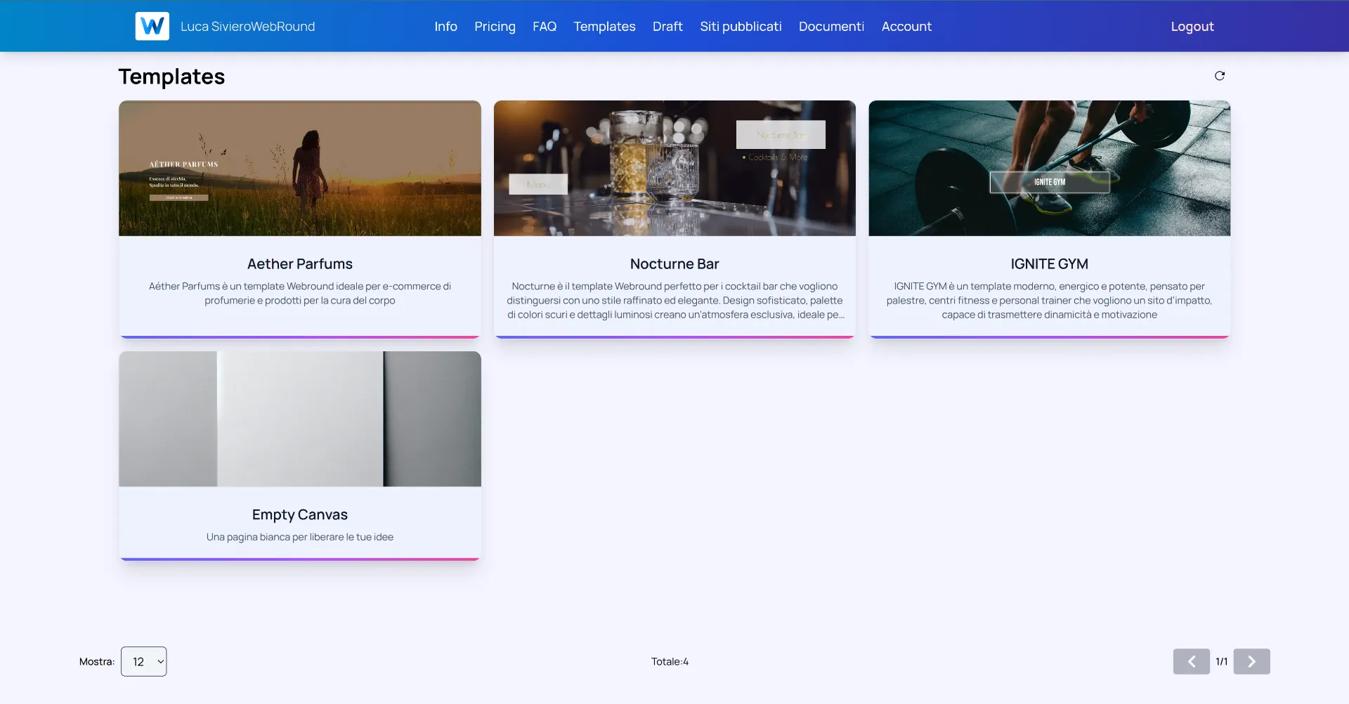
Choose the starting point for your project. You can change every single element later.
After selecting a template and naming your new Draft, navigate to the "Drafts" page. If your draft doesn't appear immediately, use the refresh icon in the top right corner.
Click on the Draft card or the blue "Update site" button to enter the Webround Editor.
2. Operating Modes
Inside the editor, Webround offers total control by allowing you to manage two different approaches, even simultaneously:
- Drag n Drop: Ideal for managing layouts, media content, and visual structure. We strongly recommend using a PC with a mouse and keyboard for maximum precision.
- Custom Code: For developers who want to inject React components, manage npm dependencies, and utilize native Tailwind CSS V4.
3. Interaction and Context Menus
The Webround interface is "context-aware." Most component editing operations are handled through context menus.
- PC: Right-click on the component or section.
- Mac:
Ctrl + Clickor right-click.
Each component has a dedicated menu exposing specific properties, whether for styling or data retrieval, as seen in Commerce or Custom components.
4. Page Architecture: Canvases
Webround divides the webpage into logical sections called Canvases. A Canvas is not just a container; it is an intelligent area that can be configured in three ways:
- Canvas: A standard area where you can drag and drop components from the library using Webround's no-code functions.
- Carousel Canvas: A special configuration that transforms the canvas into a slider of independent sub-canvases (slides).
- Custom Code Canvas: An area dedicated exclusively to injecting custom React code.
You can identify a Canvas by hovering your mouse: A standard Canvas displays a blue icon in the top left with a "+" symbol to add new components. An advanced Canvas will show different or additional icons.
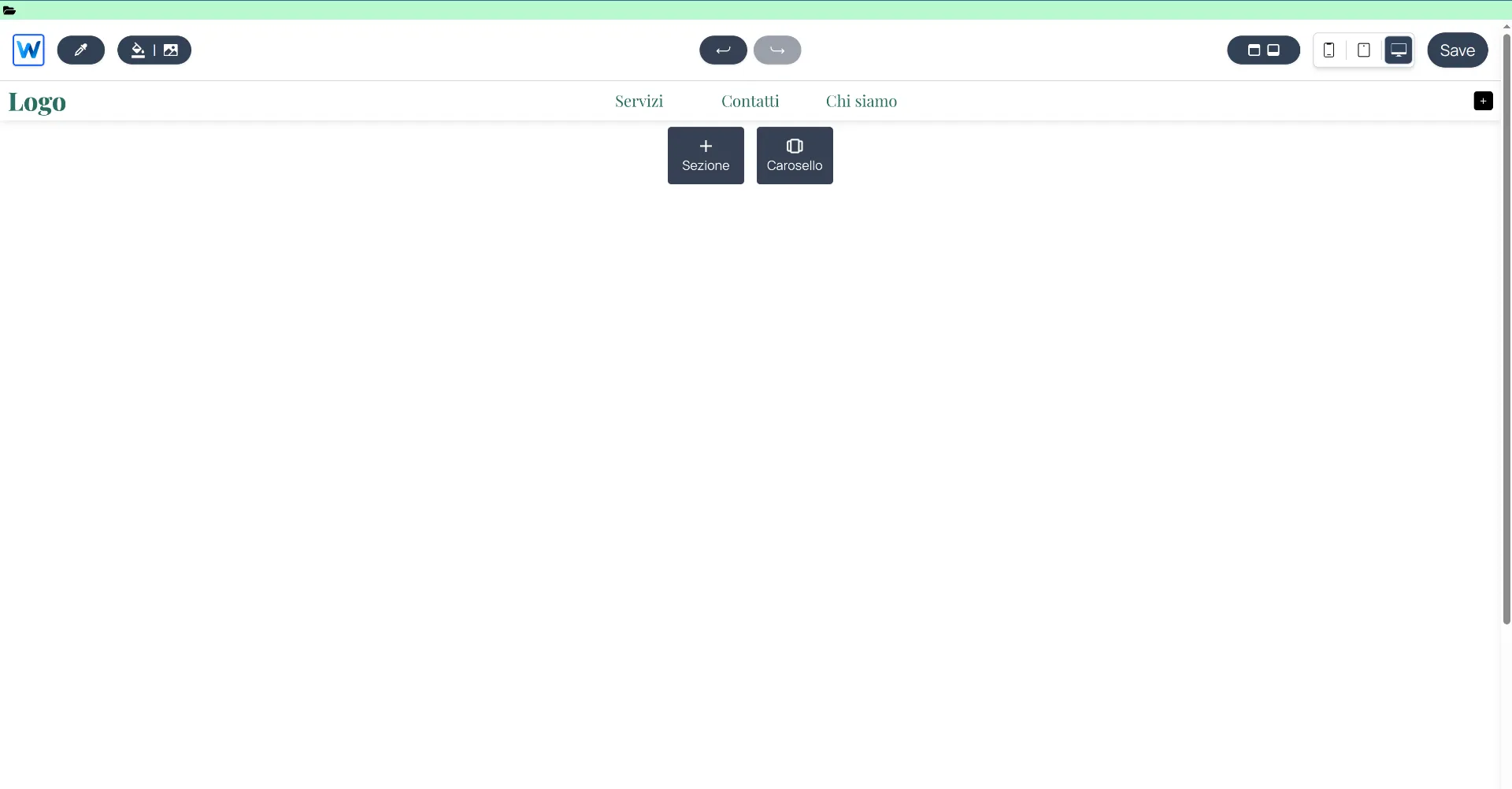
The editor interface featuring Canvas management and context menus.
5. Management Area (Header)
The editor header consists of several components, each with a specific role.
Custom File Access
The folder icon in the green area allows you to access your draft's custom files. From here, you can use the built-in editor to create and write new files and directories for your project.
Left Sidebar (W Icon)
Clicking the W in the top left opens the global project settings:
- SEO: Manage meta tags, titles, and descriptions for search engines.
- Pages & Languages: Manage multi-language support and site structure.
- E-commerce Configurations: Technical parameters for your store.
- Custom CSS: Dedicated area for CSS styling of standard builder components (excludes custom code components). Learn more
Site Mode vs. Shop Mode
The mode selector allows you to switch between managing static pages and dynamic store pages:
- Site Mode: Focuses on the design and structure of static content.
- Shop Mode: Accesses store-specific pages and interface settings. Toggle front-end features such as reviews, VAT toggle (net vs. gross prices), and wishlist buttons.
Please note: These settings only affect the site integration. To disable a feature at its root, you must do so in both the Draft settings and the WR Commerce store.
Shop Page Management (Eye Icon)
In Shop Mode, you can manage the visibility of system pages (Cart, Login, Authentication).
- Click the eye icon to hide unnecessary pages (e.g., if creating a digital catalog without a checkout).
- A slashed eye indicates those pages will not be built in the final version of your site.
- Dynamic store pages cannot be permanently deleted. Learn more
Color and Background Tools
- Color Picker: An integrated eyedropper tool to pick any color from your screen and save it to your palette.
- Page Background: Change the background color or image for the current page. This setting is page-specific.
Control and History
In the center, you have the standard Undo and Redo buttons. Note: The history only tracks the last 100 changes.
Global Components (Right Sidebar)
This button opens a crucial section for site scalability. Manage elements replicated across multiple pages:
- Header & Footer: Define primary navigation areas.
- Cookie Banner: Configure privacy compliance.
- Global Custom Components: Manage React components active on all pages (ideal for widgets).
- Override: Manage overrides for hard-coded site components, such as product pages and cards. Learn more
Responsive Design and Saving
- Device Toggle: Instantly switch between Desktop, Tablet, and Mobile views.
- Save: Always click save to persist changes to your Draft.