Component Editing
Once elements are placed on the grid, Webround offers granular control over both visual appearance and functionality.
1. Editing the Canvas: The Background
The Canvas is the container that defines the section's content.
- Changing the Background: Access the Manage background section via the context menu.
- Media: You can upload images (JPG, PNG, WebP) or videos (MP4).
- Transitions: If you upload two images, you can enable a transition effect that alternates between them, creating dynamism without impacting performance.
- Overlay: You can add a color layer over the background to improve the readability of the text placed on top.
2. Editing Drag & Drop Components
Each element (Text, Image, Button) has specific properties, but management follows a consistent workflow.
Modifying Style
Opening a component's context menu reveals controls for:
- Colors and Borders: Manage palettes, opacity, and border-radius.
- Shadows and Spacing: Add depth via Box Shadow and manage internal margins (padding).
- Animations and Transitions: You can use Webround's built-in animations on almost all components and set hover transitions for buttons.
- Custom Style: If you define classes in the site's CSS file, you can call those classes and apply them to components.

The context menu for editing Webround elements
Below are the common toolbar functions:
- : Allows you to apply CSS classes defined in your site.
- : Allows you to modify styles such as wrapper background, borders, shadows, blur effects, padding, and margins.
- : Manage the vertical alignment of your component relative to its wrapper (drag & drop container).
- : Use this menu to decide on which devices a component should be hidden or displayed.
- : Each component can be identified with a specific ID, allowing you to insert anchor links to navigate directly to it.
- : Directly copy all wrapper properties from one device to another.
- : Copying a component is available via keyboard (Ctrl + Shift + C) or the dedicated button.
- and : Layer components using the z-index property to create overlapping effects, such as text over an image.
- : Delete a component by clicking here or using the Alt + Del combination.
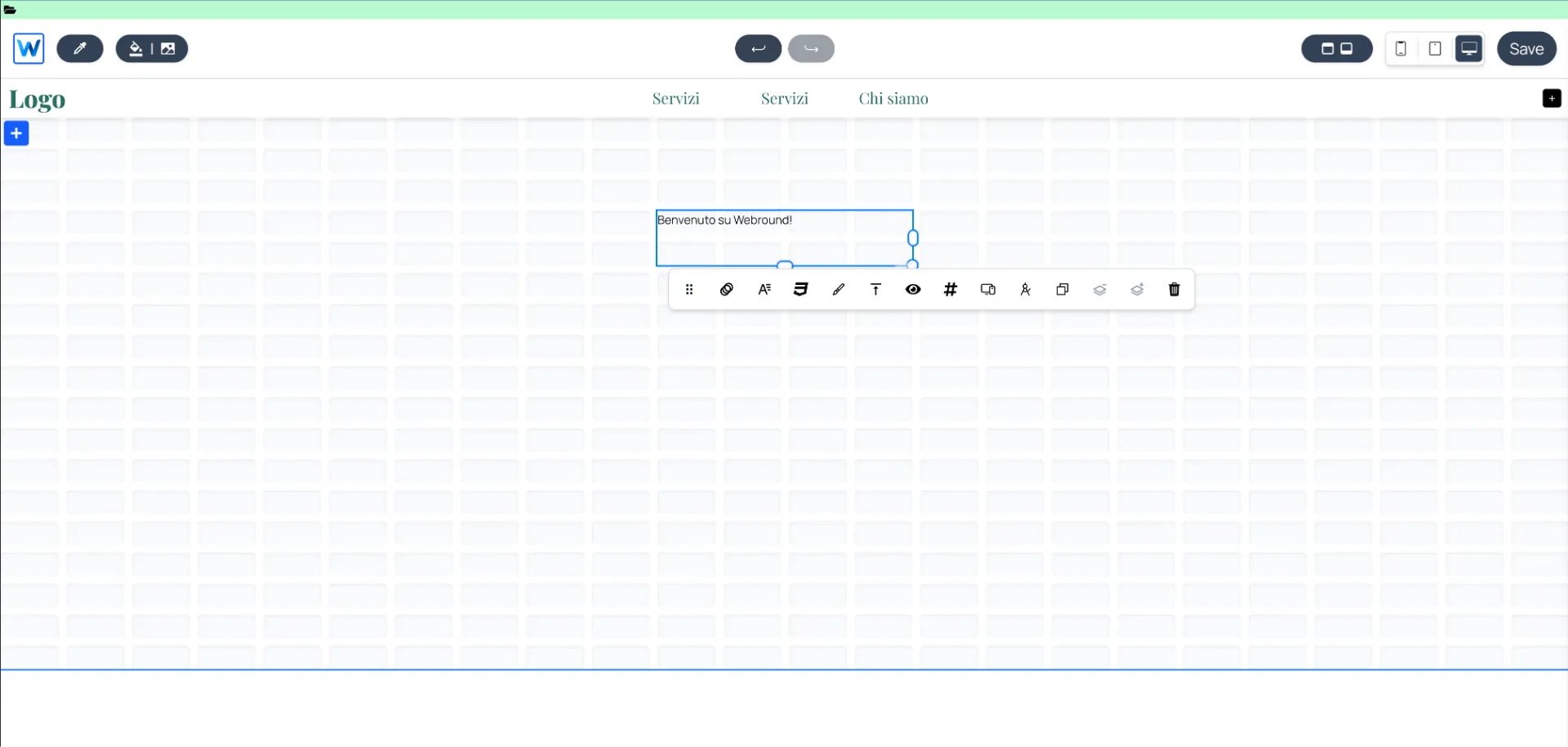
Modifying Text
Text wrappers are among the most important elements. Webround uses a Lexical implementation to handle text:
- Click on the text to enter editing mode.
- Write your content.
- Use the toolbar to change font, weight, size, and alignment.
- Use the context menu (right-click) to change wrapper properties, such as borders, shadows, animations, or vertical alignment.
The editing interface for the text component
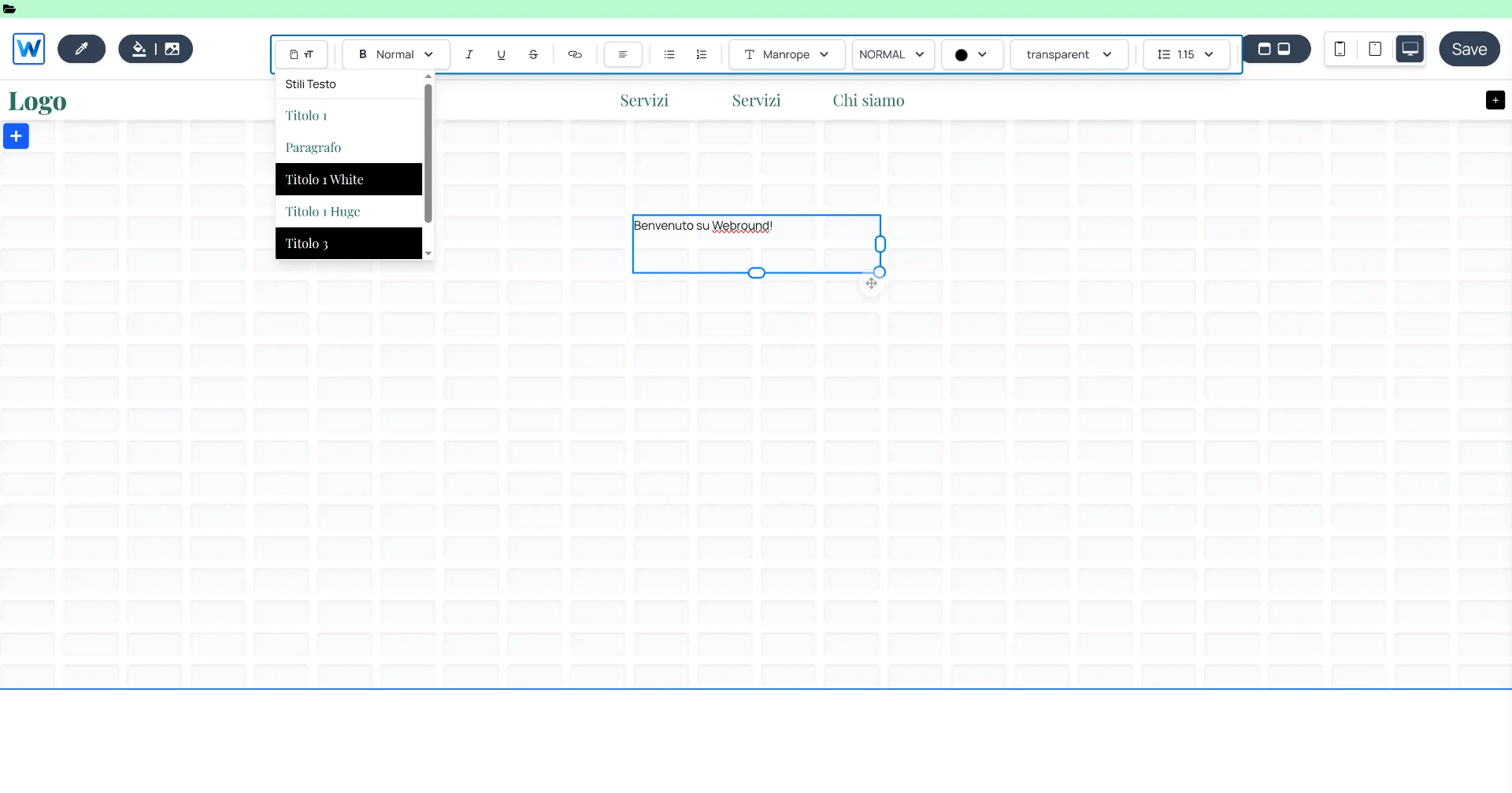
For example, to change the font or font size, use the element.
Clicking this allows you to specify new reusable styles. Warning: modifying a style updates all text components using that style. We recommend defining your fonts and colors in advance to keep your site organized and speed up content creation. You can define up to 24 custom styles.
Default styles can be applied by selecting the desired text and clicking the text storage icon in the toolbar:
The editing interface for selected text styles
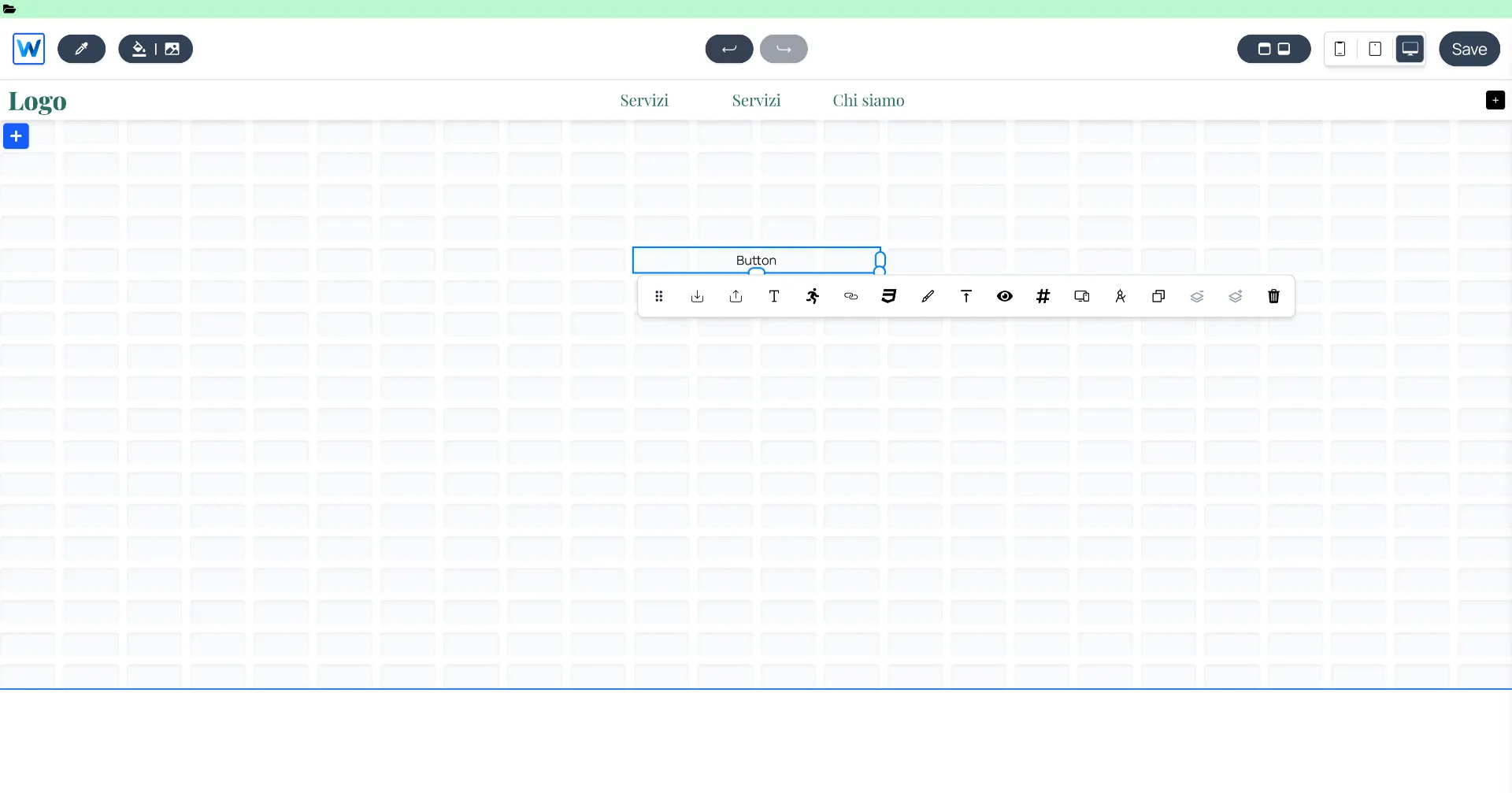
Inserting a Button with a Link
After dragging a button into the Canvas:
- Right-click to open the context menu.
- Click the link icon and enter the destination URL. You can link to an external URL, an internal Webround page, a phone number, or an email.
- When linking to the Shop page, you can define filters by collection or tag. Navigation will automatically apply these filters.
The editing interface for button styles
To store button styles, use the element.
This menu allows you to save up to 3 standard styles for your buttons, enabling you to replicate the same design across multiple sections.
Other options include:
- To load a predefined style, use
- To edit the text, use the icon
- To manage hover animations, use the icon
- To insert a navigation link, use the icon
Adding Animations
Every component can be animated for a smooth entrance:
- In the context menu, select the Animations icon.
- Choose from the available effects.
- Adjust the delay and duration to create cascading effects as the user scrolls.
Custom Style (Tailwind & CSS)
For advanced designers, every component has a Custom Style field accessible via the CSS icon in the context menu. Here you can inject specific CSS classes, managing both the inner component (content) and the outer component (wrapper), as well as visibility-based classes.
Contact Forms
Easily integrate contact forms using the "Form" component. You can manage the style of individual fields and the input container. Options are always accessible via right-click.
Ensure you manage contact form integration with a predefined messaging system in Webround. You can use Webround Email or one of the available services by connecting your API Keys.
3. Managing Product Card Changes
Product Cards are special components because they are directly synchronized with your catalog.
- Dynamic Data: Price, title, and image are automatically retrieved from your WR Commerce store.
- Global Style: Modify a card's design (borders, price font, navigation button style). Changes are automatically applied to all cards in the gallery to maintain consistency.
- Override: If you need a completely different card, you can use the Custom Override function in the Right Sidebar to replace the standard component with your own code.
How to Edit Product Cards
These components appear in various elements, such as horizontal galleries. However, Product Cards can only be edited from the Shop page. To make changes, open the Shop page and hover over the product area. You will find several settings, including:
- Dimensions: Set image height and the number of items per row.
- Text: Apply specific fonts, colors, and styles to card text.
- Image: Apply borders, shadows, or effects to images.
- Pagination: Manage the style of the page navigation buttons.
Replicate button and text designs using custom styles. Use the context menu to save or load a specific style to optimize your workflow.
4. Shortcuts
Use the following commands to speed up your workflow:
- Ctrl + Shift + C: Copy components.
- Ctrl + Shift + V: Paste components.
- Ctrl + Shift + X: Cut components.
Drag your mouse over a Canvas to select multiple elements at once to move, copy, or cut them.
To replicate a Canvas configuration across different devices, access the Canvas context menu to manage the copy function.