Custom Code Components (React)
Webround integrates a professional development environment that allows you to write custom React code. Thanks to an esbuild-based compiler, every component is isolated and served using modern standards, enabling users to implement any component they can imagine.
1. Development Environment
Code is managed through a native integration with the Monaco Editor, the same engine behind VS Code. This ensures classic shortcuts, syntax highlighting, and intellisense directly within the browser.
- Languages: Full support for
.jsx,.tsx,.css, and.json. - Tailwind v4: You can write Tailwind classes natively. These are extracted during the build, processed, and injected locally.
- Real-time Compilation: Every save triggers a build process that packages the code into an isolated bundle.
2. Architecture and Shadow DOM
To prevent conflicts between custom code and the rest of the platform, Webround transforms every source file into a Web Component (Custom Element).
Total Isolation
The use of Web Components and Shadow DOM isolation provides several key advantages:
- Scoped CSS: CSS (including Tailwind-generated styles) is encapsulated. It cannot "leak" out of the component or affect the site's global styling.
- Dependency Independence: Each build includes its own dependencies. If Webround updates its core (e.g., a new React version), your component will continue to function using the version specified in its bundle, avoiding breaking changes.
- Script Conflicts: Global scripts or external libraries loaded on the site cannot accidentally manipulate the internal DOM of your component.
Webround provides each editor with a specific domain per Draft ID. This means that any source code will only be able to communicate exclusively within that editor. It cannot communicate with the wrapper (editor.webround.com) or with editors of other drafts. Since they have a different origin, the browser's Same Origin Policy prevents script injection or the reading of cookies and local data across different origins.
3. Dependency Management and package.json
The package.json file must reside in the project's root. This is the instruction file for the compiler: here you define the entry point and the external libraries you wish to use.
- Package Installation: You can integrate any library available on NPM.
- Version Specifications: Since there is no interactive
npm installcommand, you must retrieve the exact version from the official NPM website and enter it manually.
Here is an example:
{
  "name": "wr-custom-component",
  "version": "1.0.0",
  "dependencies": {
    "react": "18.3.1",
    "react-dom": "18.3.1",
    "react-router-dom": "^6.22.0"
  }
}
4. Webround Bridge & SDK (Prop wr)
Every custom component automatically receives a prop called wr. This object acts as a bridge between your code and the Webround ecosystem, exposing vital data and functions:
- State: Real-time access to reactive data for
Shop,Customer,Cart, andAccount. Any modification to these states within the platform core automatically updates your component. - Actions: Universal methods to interact with the system, such as cart management, triggering programmatic navigation (page changes), or changing localization.
- Events: Automatic synchronization via Custom Events (e.g.,
wr-shop-update) that map system data to the component's internal state.
In the following sections, we will explore some component examples that demonstrate the advantages of programming with React on Webround.
5. Integration Methods
Custom code can be integrated into your draft in three ways:
- Custom Section: An independent block inserted directly into the editor. It is ideal for visible sections like landing page components, visible external integrations, and more.
- Override: Full replacement of an existing standard component's logic with your own code. This allows you to replace hard-coded components, such as the site header or product cards.
- Injection: Dynamic insertion via predefined slots (hook points) in the template layout. Extend the style of classic components by attaching additional custom components.
The compiler supports the importation of local files. You can break down the logic into multiple files and subfolders; the build process will aggregate everything into a single optimized bundle.
6. Quick Examples
Below we will see 3 simple examples showing how to integrate custom components into your Webround site.
1. Custom Landing Page
This example demonstrates how to load components into custom code sections.
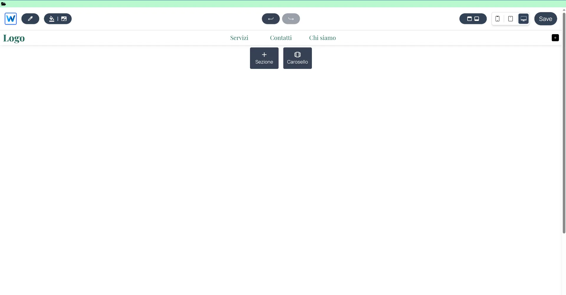
Open your draft and access editor.webround.com
The top bar allows you to access the custom files you have created for this draft. Click on the folder icon: you will enter the Webround custom code editor.

You have entered the Webround custom code editor
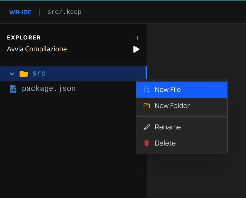
First, let's create a package.json file by right-clicking on an empty area of the sidebar:

Right-click on an empty area of the sidebar to create a new file. Name it package.json and press Enter.
Insert the following content:
{
    "name": "@webround/landing-page",
    "version": "1.0.0",
    "description": "A sample landing page to showcase how Webround integrates React",
    "dependencies": {
        "react": "18.3.1",
        "react-dom": "18.3.1",
        "react-router-dom": "^6.22.0",
        "framer-motion": "^11.0.0"
    }
}
Use the Ctrl + S shortcut to save.
When the local version of your file is out of sync with the Cloud version, you will notice a dot icon next to the filename.
You can also save by Right-click > Save file.
Adding the code
Now, let's create a new folder and call it 'src'.
The process is always the same: Right-click > New Folder > type 'src' and press Enter.
Next, right-click on the folder and create a new file:
Name the file 'LandingPage.jsx' and press Enter.
Once you have created the file, your structure should look like this:
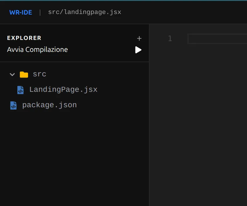
You are now ready to insert your custom code.
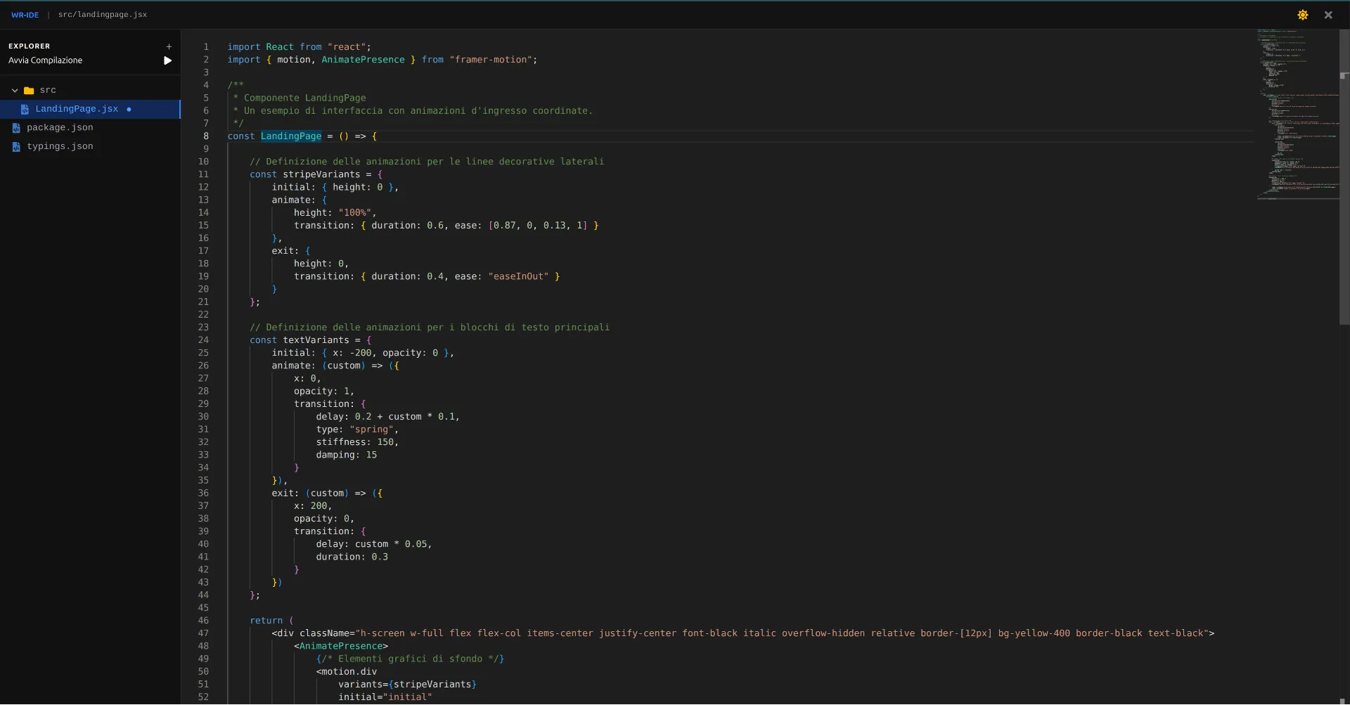
After building this structure, select the LandingPage.jsx file and paste the following React code:
import React from "react";
import { motion, AnimatePresence } from "framer-motion";

/**
 * LandingPage component
 * An example of a landing page with organized entry animations.
 */
const LandingPage = () => {

    // Animation definitions for framer-motion
    const stripeVariants = {
        initial: { height: 0 },
        animate: {
            height: "100%",
            transition: { duration: 0.6, ease: [0.87, 0, 0.13, 1] }
        },
        exit: {
            height: 0,
            transition: { duration: 0.4, ease: "easeInOut" }
        }
    };

    const textVariants = {
        initial: { x: -200, opacity: 0 },
        animate: (custom) => ({
            x: 0,
            opacity: 1,
            transition: {
                delay: 0.2 + custom * 0.1,
                type: "spring",
                stiffness: 150,
                damping: 15
            }
        }),
        exit: (custom) => ({
            x: 200,
            opacity: 0,
            transition: {
                delay: custom * 0.05,
                duration: 0.3
            }
        })
    };

    return (
        <div className="h-screen w-full flex flex-col items-center justify-center font-black italic overflow-hidden relative border-[12px] bg-yellow-400 border-black text-black">
            <AnimatePresence>
                {/* Background elements */}
                <motion.div
                    variants={stripeVariants}
                    initial="initial"
                    animate="animate"
                    exit="exit"
                    className="absolute left-10 top-0 w-4 bg-black hidden md:block"
                />
                <motion.div
                    variants={stripeVariants}
                    initial="initial"
                    animate="animate"
                    exit="exit"
                    className="absolute right-10 bottom-0 w-4 bg-black hidden md:block"
                />

                {/* Hero section */}
                <div className="relative z-10 flex flex-col items-center select-none">
                    <div className="flex flex-col text-[18vw] md:text-[14vw] leading-[0.75] tracking-[-0.05em] uppercase">
                        <motion.div
                            custom={0}
                            variants={textVariants}
                            initial="initial"
                            animate="animate"
                            exit="exit"
                            className="flex items-center"
                        >
                            <span className="bg-black text-yellow-400 px-4 py-2 transform -rotate-2">NEW</span>
                            <span className="ml-4">DROP</span>
                        </motion.div>

                        <motion.div
                            custom={1}
                            variants={textVariants}
                            initial="initial"
                            animate="animate"
                            exit="exit"
                            className="text-right"
                        >
                            ONLINE
                        </motion.div>
                    </div>

                    {/* Spring effect for small badge */}
                    <motion.div
                        initial={{ scale: 0, rotate: -15 }}
                        animate={{ scale: 1, rotate: 2 }}
                        exit={{ scale: 0, opacity: 0 }}
                        transition={{ delay: 0.5, type: "spring" }}
                        className="mt-8 bg-black text-white px-6 py-2 text-xl md:text-2xl shadow-[8px_8px_0px_#fff]"
                    >
                        CUSTOM CODE // COMPONENT
                    </motion.div>
                </div>

                {/* Footer / Call to Action */}
                <motion.div
                    initial={{ y: 200 }}
                    animate={{ y: 0 }}
                    exit={{ y: 200 }}
                    transition={{ duration: 0.5, ease: "backIn" }}
                    className="absolute bottom-0 w-full h-24 md:h-32 bg-black text-yellow-400 text-2xl md:text-4xl font-black uppercase tracking-tighter flex items-center justify-center group cursor-pointer hover:bg-white hover:text-black transition-colors duration-300"
                >
                    <span className="group-hover:mr-8 transition-all duration-300">DISCOVER THE COLLECTION</span>
                    <span className="hidden group-hover:inline">[→]</span>
                </motion.div>
            </AnimatePresence>
        </div>
    );
};

export default LandingPage;
Now all that’s left is to save and start the compilation (after saving):
Save with Ctrl + S, wait for the save to complete, and click on "Start compilation."
Wait for the compilation to finish: you will see a banner in the bottom right corner showing the build status.
Now that you have completed the compilation, you can insert the code into a custom code section.
- Close the code editor and enter the site editing interface.
- Open the context menu on a Canvas (Right-click) and scroll down to the "ADD" section. Select "Add custom code."
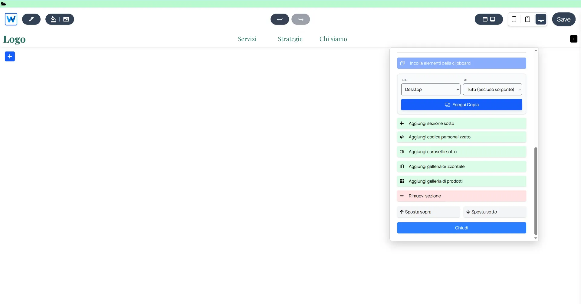
Click on "Add custom code."
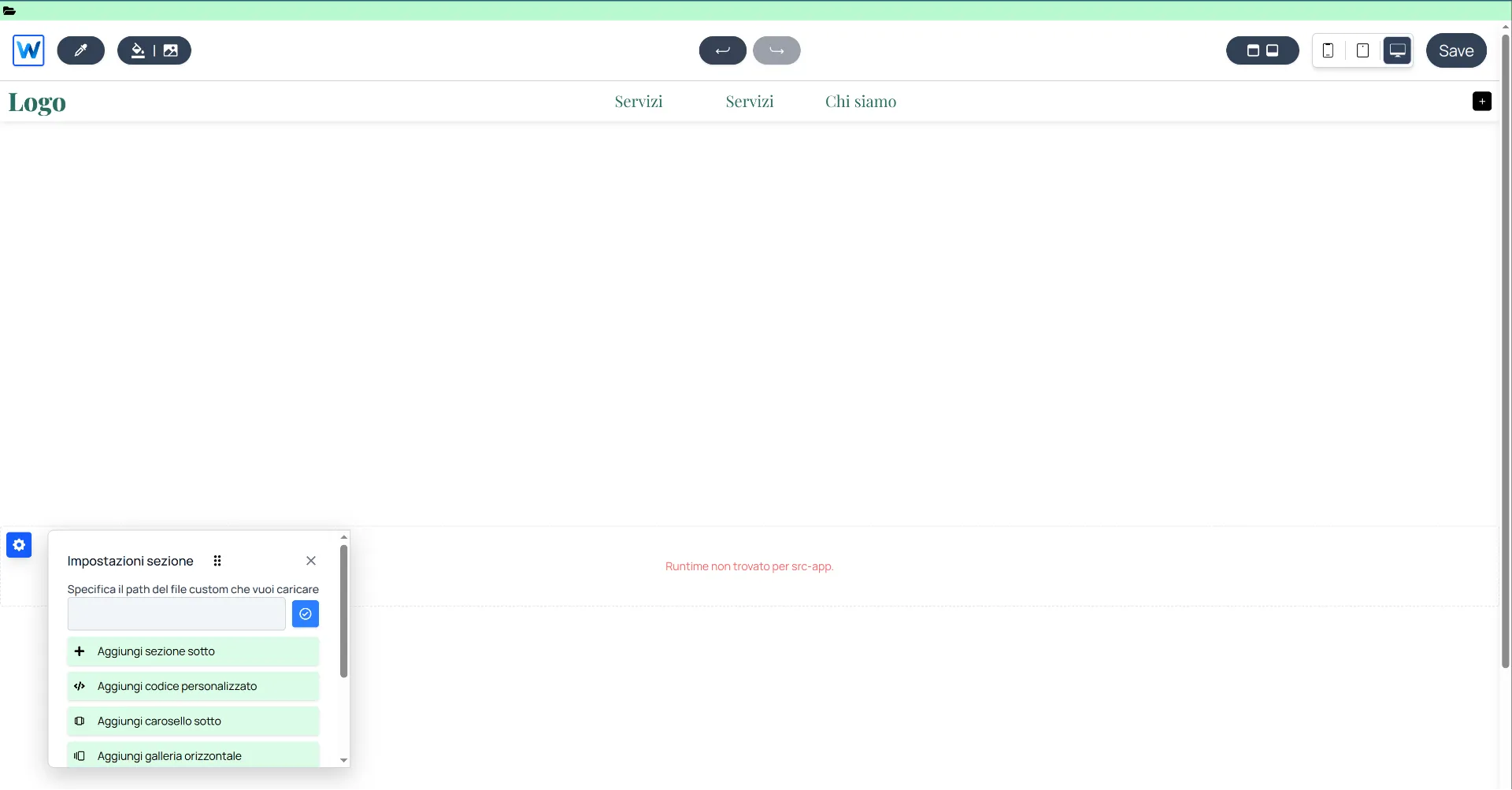
This custom code section will be empty and will try, by default, to load the code from the path src/App. Since we defined ours as src/LandingPage.jsx, enter this exact path into the text input that appears when clicking the gear icon in the top left of the custom code section.
Click on "Add custom code."
Enter src/LandingPage.jsx and click the blue button to apply the change.
At this point, you will see the component load:
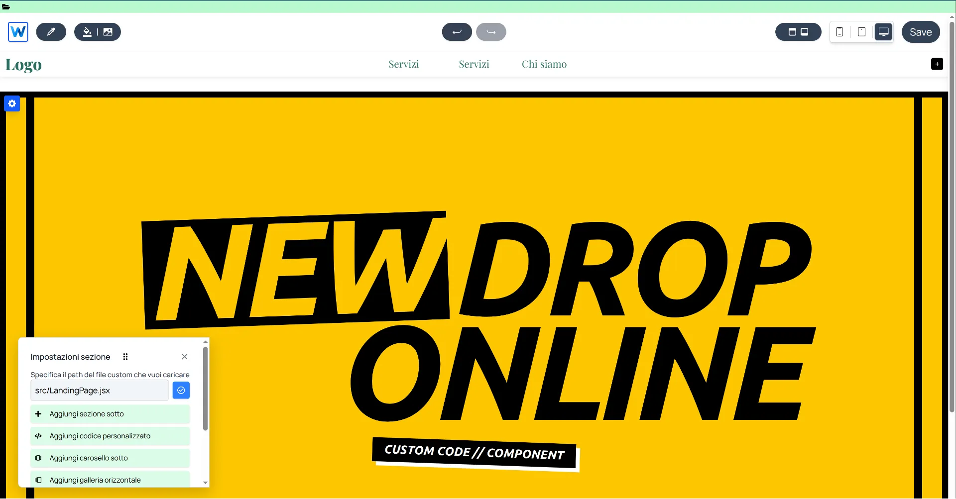
Congratulations! You have loaded your first custom component in Webround!
Summary of what we covered:
- How to access the Webround code editor: Click the folder icon in the top left to enter.
- Defining dependencies: Never forget to create the
package.jsonfile: without it, the compilation will fail. - Framer-motion integration: We successfully integrated the
framer-motionlibrary and used its components inside our Landing Page. - Using Tailwind: No configuration was required to integrate Tailwind classes: Webround natively parses classes during the compilation phase.
2. Custom Header
In this example, we will explore a different type of customization. The header in Webround sites is a global component whose configuration is replicated across all pages. Instead of adding or removing a section, we will apply an override.
Below, we will focus primarily on the code and key interface elements, assuming you are already familiar with how to interact with the code editor.
Let's start by modifying the package.json:
{
    "name": "@webround/custom-integration",
    "version": "1.0.0",
    "description": "A sample to showcase how Webround integrates React",
    "dependencies": {
        "react": "18.3.1",
        "react-dom": "18.3.1",
        "react-router-dom": "^6.22.0",
        "framer-motion": "^11.0.0",
        "react-icons": "^0.284.0"
    }
}
If you have already created a package.json from the previous example, you only need to update the dependencies object. There is no need to specify multiple package.json files, nor do you need to change the name, version, or description for every modification.
Let's create a custom file inside the src folder and name it "Header.jsx".
import React, { useState } from "react";
import { VscMenu, VscClose, VscSearch, VscArrowRight } from "react-icons/vsc";
import { FiShoppingBag } from "react-icons/fi";

/**
 * SiteHeader: a custom header that overrides the stock one in Webround.
 */
const SiteHeader = ({ wr }) => {
  const [isMenuOpen, setIsMenuOpen] = useState(false);
  const [isSearchOpen, setSearchOpen] = useState(false);
  const [searchTerm, setSearchTerm] = useState("");

  const brandName = "WEBROUND";
  const navigation = [
    { label: "Home", path: "/" },
    { label: "Shop", path: "/shop" },
  ];

  const cartCount = wr?.customer?.state?.cache?.cart?.all?.data?.items?.length || 0;

  const handleLinkClick = (e, path) => {
    e.preventDefault();
    if (wr?.utils?.navigate) {
      wr.utils.navigate(path);
      setIsMenuOpen(false);
    }
  };

  const handleSearch = (e) => {
    if (e) e.preventDefault();
    if (wr?.shop?.applySearch) {
      wr.shop.setSearch(searchTerm);
      wr.shop.applySearch(searchTerm);
      setSearchOpen(false);
      wr.utils.navigate("/shop");
    }
  };

  return (
    <div className="relative w-full bg-white text-black border-b-4 border-black z-[100]">
      <div className="max-w-[1920px] mx-auto px-4 md:px-8 h-20 md:h-24 flex items-center justify-between relative">

        {/* SEARCH INLINE */}
        {isSearchOpen && (
            <div className="absolute inset-0 z-[110] bg-yellow-400 flex items-center px-4 md:px-8 border-b-4 border-black animate-in slide-in-from-top duration-150">
                <form onSubmit={handleSearch} className="flex w-full items-center gap-4">
                    <VscSearch className="text-2xl md:text-3xl" />
                    <input
                        autoFocus
                        type="text"
                        value={searchTerm}
                        onChange={(e) => setSearchTerm(e.target.value)}
                        placeholder="SEARCH..."
                        className="flex-grow bg-transparent border-none text-black placeholder-black/30 text-2xl md:text-4xl font-black italic outline-none uppercase tracking-tighter"
                    />
                    <button type="submit" className="p-2 bg-black text-white hover:bg-white hover:text-black border-2 border-black transition-all">
                        <VscArrowRight className="text-2xl" />
                    </button>
                    <button
                        type="button"
                        onClick={() => setSearchOpen(false)}
                        className="p-2 border-2 border-black hover:bg-black hover:text-white transition-all"
                    >
                        <VscClose className="text-2xl" />
                    </button>
                </form>
            </div>
        )}

        {/* Nav & Menu Trigger */}
        <div className="flex items-center gap-4 flex-1">
          <button
            className="p-2 border-2 border-black hover:bg-black hover:text-white transition-colors"
            onClick={() => setIsMenuOpen(true)}
          >
            <VscMenu className="text-xl md:text-2xl" />
          </button>

          <nav className="hidden lg:flex gap-6">
            {navigation.map((item, idx) => (
              <a
                key={idx}
                href={item.path}
                onClick={(e) => handleLinkClick(e, item.path)}
                className="text-[11px] font-black uppercase tracking-tighter italic hover:line-through transition-all"
              >
                {item.label}
              </a>
            ))}
          </nav>
        </div>

        {/* Center: Logo */}
        <a
            href="/"
            onClick={(e) => handleLinkClick(e, "/")}
            className="flex-shrink-0 cursor-pointer"
        >
            <h1 className="text-2xl md:text-4xl font-black italic tracking-tighter uppercase">
                {brandName}<span className="text-yellow-400">.</span>
            </h1>
        </a>

        {/* Actions */}
        <div className="flex items-center justify-end gap-2 md:gap-4 flex-1">
          <button
            className="hidden md:flex items-center justify-center w-10 h-10 border-2 border-black hover:bg-black hover:text-white transition-all"
            onClick={() => setSearchOpen(true)}
          >
            <VscSearch className="text-xl" />
          </button>

          <a
            href="/cart"
            onClick={(e) => handleLinkClick(e, "/cart")}
            className="relative flex items-center justify-center w-10 h-10 border-2 border-black bg-black text-white hover:bg-yellow-400 hover:text-black transition-all"
          >
            <FiShoppingBag className="text-xl" />
            <span className="absolute -top-2 -right-2 bg-red-600 text-white text-[10px] font-black px-1 border-2 border-black shadow-[2px_2px_0px_black]">
              {cartCount}
            </span>
          </a>
        </div>
      </div>

      {/* OVERLAY MENU */}
      {isMenuOpen && (
        <div className="fixed inset-0 z-[9999] bg-yellow-400 text-black flex flex-col p-6 md:p-12 w-screen h-screen overflow-hidden animate-in fade-in duration-200">
            <div className="flex justify-between items-center border-b-4 border-black pb-6">
                <span className="text-4xl font-black italic tracking-tighter uppercase">{brandName}</span>
                <button
                    onClick={() => setIsMenuOpen(false)}
                    className="p-2 border-4 border-black bg-black text-white hover:bg-white hover:text-black transition-all"
                >
                    <VscClose className="text-4xl" />
                </button>
            </div>

            <nav className="flex-1 flex flex-col justify-center gap-2">
                {navigation.map((item, idx) => (
                    <a
                        key={idx}
                        href={item.path}
                        onClick={(e) => handleLinkClick(e, item.path)}
                        className="text-5xl md:text-8xl font-black uppercase italic tracking-tighter text-left leading-none hover:text-white transition-all"
                    >
                        {item.label}
                    </a>
                ))}
            </nav>

            <div className="border-t-4 border-black pt-6 flex justify-between font-black uppercase italic text-[10px] md:text-xs">
                <div className="flex flex-col">
                    <span>{brandName} Drop 01</span>
                    <span className="text-black/40">Webround Software</span>
                </div>
                <span className="self-end">{new Date().getFullYear()}</span>
            </div>
        </div>
      )}
    </div>
  );
};

export default SiteHeader;
Create the file and start the compilation.
Now that you have compiled your custom Header, all that's left is to integrate it into the site.
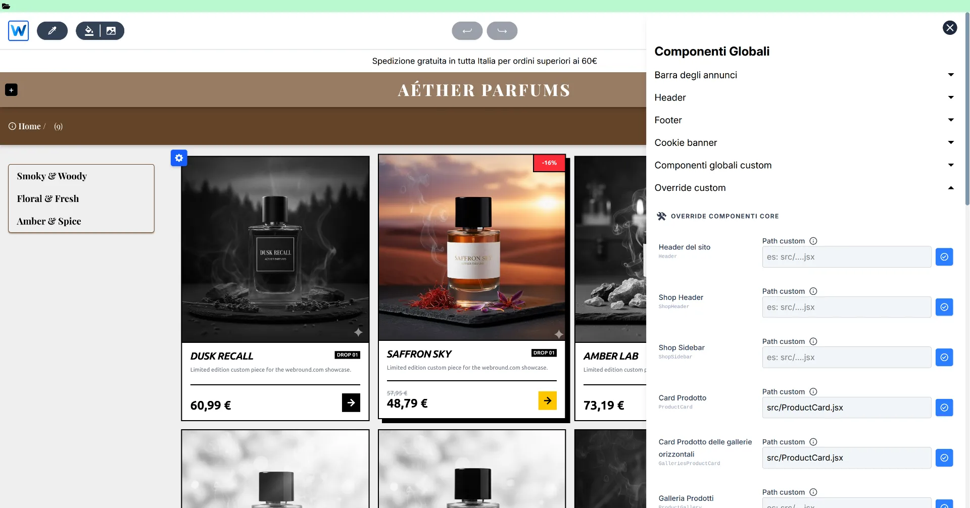
Access the global component management menu found in the editor header and open the "Custom Override" section:
Now, in the "Site Header" entry, enter the value src/Header.jsx (or whatever the path to your custom component is) and click the blue button to apply.
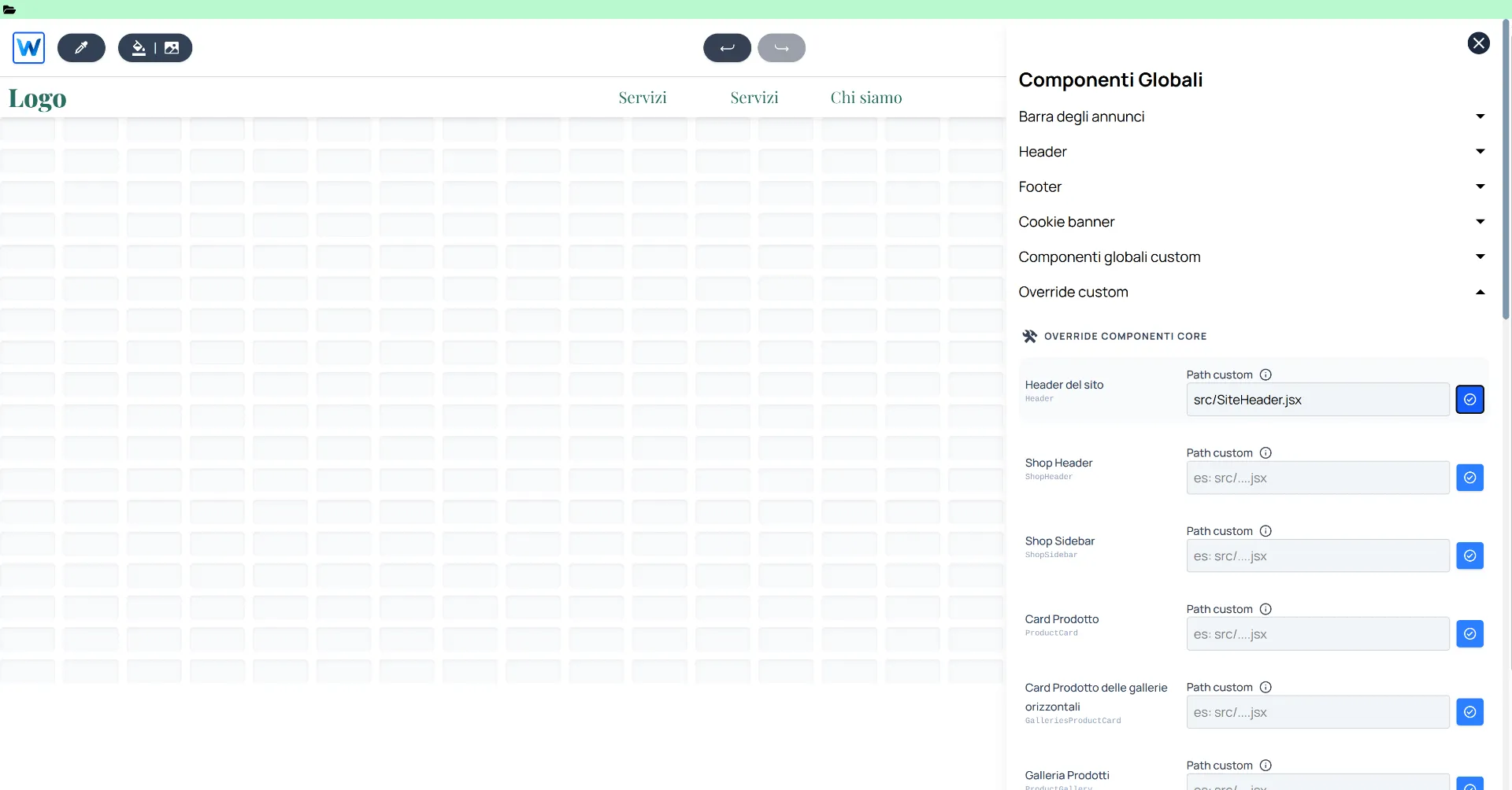
Enter the path to the custom component and click the blue button to apply.
Now your site has a new header that fully integrates Webround features through the native wr prop.
Summary of what we covered
- Overriding hard-coded components: With the override menu, you can replace almost any Webround component at will. You can revolutionize your site and integrate anything you want.
- Native WR SDK Integration: The wr prop, passed into the component, is available for all system components and integrates basic functions that allow you to manage the site state and API calls quickly and easily. For example, to navigate to a page, you can simply use
wr.utils.navigate, maintaining consistency between the editor and the final site without worrying about path or language management! - Cart item count: Also thanks to the WR SDK, you can interact with states and objects like the customer, which provides a consistent cache of all related data, such as the cart.
3. Custom Product Cards
At this point, we assume you have become familiar with the editor. We will only show the code for the product cards and the before/after results.
Product cards are among the most critical elements of an e-commerce site, immediately communicating visual identity. In many cases, they are packed with features, complex styling elements, and shortcuts, such as "add to cart."
However, product cards live within grids and filtered lists, so it is fundamental to receive the correct props.
If you create a component intended for use as a Product Card, you can access the wr.product prop. You will receive this natively within the wr object if you perform an override on the "Product Card" component.
To modify the product cards, create a file inside src and name it "ProductCard.jsx".
Insert this code and save:
import React from "react";

/**
 * ProductCard - Custom component that overrides the stock Product Cards in Webround.
 * Leverages the 'wr' prop to access WR SDK.
 */
const ProductCard = ({ wr }) => {
    // Extract product data: each card automatically receives a different product
    const product = wr?.product;

    // Early return to avoid errors
    if (!product) return null;

    // Select the first or favourite product variant
    const variant = product.variants?.find((v) => v.isFavourite) || product.variants?.[0];
    const coverUrl = variant?.assets?.[0]?.url || product?.assets?.[0]?.url || "";

    // Calculate price, discounts and currencies
    const priceRange = variant?.priceRanges?.[0];
    const price = priceRange?.grossMin || 0;
    const comparePrice = priceRange?.compareGrossMin || 0;
    const currency = priceRange?.currencyCode || "EUR";

    // Utility to format prices
    const formatPrice = (value) => {
        return new Intl.NumberFormat("it-IT", {
            style: "currency",
            currency: currency,
        }).format(value);
    };

    /**
     * Handling click on the component
     * Leveraging wr utilities to synchronize the website state and navigate correctly.
     */
    const handleProductClick = () => {
        if (wr?.shop) {
            wr.shop.selectProduct(product);
            wr.shop.selectVariant(variant);
        }
        if (wr?.utils?.navigate) {
            wr.utils.navigate("product");
        }
    };

    return (
        <div
            className="group relative flex flex-col w-full h-full bg-black border-2 border-black overflow-hidden transition-all duration-300 hover:-translate-y-1 hover:shadow-[8px_8px_0px_0px_rgba(0,0,0,1)]"
            onClick={handleProductClick}
        >
            {/* Image container */}
            <div className="relative aspect-square overflow-hidden bg-gray-200 border-b-2 border-black">
                <img
                    src={coverUrl}
                    alt={product.name}
                    className="w-full h-full object-cover transition-all duration-500 grayscale group-hover:grayscale-0 group-hover:scale-105"
                />

                {/* Discount badge */}
                {comparePrice > price && (
                    <div className="absolute top-0 right-0 bg-yellow-400 text-black text-xs font-black px-4 py-2 border-l-2 border-b-2 border-black z-10 rotate-0 group-hover:bg-red-500 group-hover:text-white transition-colors">
                        -{Math.round(((comparePrice - price) / comparePrice) * 100)}%
                    </div>
                )}
            </div>

            {/* Product details */}
            <div className="p-4 bg-white flex flex-col flex-grow justify-between">
                <div>
                    <div className="flex justify-between items-start mb-2">
                        <h3 className="text-xl font-black leading-none uppercase italic tracking-tighter w-2/3">
                            {product.name}
                        </h3>
                        <div className="flex flex-col items-end">
                            <span className="text-[10px] font-bold bg-black text-white px-1 mb-1">
                                {product.category?.name || "DROP 01"}
                            </span>
                        </div>
                    </div>

                    <p className="text-[11px] text-gray-500 font-medium line-clamp-2 mb-4">
                        {product.description || "Limited edition custom piece for the webround.com showcase."}
                    </p>
                </div>

                {/* CTA: show price and discount price */}
                <div className="flex items-end justify-between border-t-2 border-black pt-4 mt-auto">
                    <div className="flex flex-col">
                        {comparePrice > price && (
                            <span className="text-xs text-gray-400 line-through font-bold">
                                {formatPrice(comparePrice)}
                            </span>
                        )}
                        <span className="text-2xl font-black text-black leading-none">
                            {formatPrice(price)}
                        </span>
                    </div>

                    {/* CTA */}
                    <div className="bg-black text-white p-2 group-hover:bg-yellow-400 group-hover:text-black transition-colors">
                        <svg width="20" height="20" viewBox="0 0 24 24" fill="none" stroke="currentColor" strokeWidth="3" strokeLinecap="square" strokeLinejoin="miter">
                            <path d="M5 12h14M12 5l7 7-7 7" />
                        </svg>
                    </div>
                </div>
            </div>
        </div>
    );
};

export default ProductCard;
Now compile the new code, wait until it's ready, and access the global components override menu. Navigate to the "Product Card" property and enter src/ProductCard.jsx. Head over to the shop and check your catalog: you will see complex, fully revamped product cards compared to the standard Webround cards.
Try clicking on a product; you will see that navigation to the detail page is handled through the WR SDK utilities.
Summary of what we covered
- Overriding style without rethinking logic: We successfully integrated a highly customized style compared to the standard one, without wasting time reprogramming navigation or product fetching.
- WR SDK: Thanks to wr.product, we can immediately access the n-th product available on the page, regardless of which part of the catalog is being browsed.
- Data Access: Using the wr.shop.selectProduct and wr.shop.selectVariant functions, we can set the correct data for navigation. These examples provide a clearer picture of how the
wrprop manages data and utilities.
Now that you have seen these examples, you are ready to integrate new features!
Next Steps: we are excited to see what you will build on Webround, so get comfortable and start integrating new React components!